
Salve a tutte e a tutti…
Mi scuso per essere stato assente per molto tempo….intanto ho ultimato dei lavori ed ora sono pronto a mostrarveli.
Direttamente dalla ForgeWorld ecco ” Sayl the Faithless and Nightmaw”…

Una coppia di miniature molto belle e facilmente inseribili in qualsiasi gioco….
Il materiale in cui sono state stampate è una resina di colore grigio abbastanza elastica. I modelli presentavano diverse sbavature e , purtroppo, bolle d’aria che rovinavano diversi particolari. Dopo diverse ore di rifilatura delle sbavature e riempimenti del fori lasciate dalle bolle d’aria, ho dato un praimer di colore bianco.
[LEGENDA COLORI: GW = GAMES WORKSHOP – VAL = VALLEJO – W&N = WINSOR & NEWTON]
Hello everybody…
I apologize me to have been absent for a lot of time….meanwhile I completed some works and I am ready to show them to you.
Directly from Forgeworld here “Sayl the Faithless and Nightmaw” …
Sayl The Faithless and nightmaw
A couple of very beautiful miniatures and easily inseribili in any game….
The material in which they have been printed is an enough elastic resin of grey color. The models had several smudges and, unfortunately, air bubbles that ruined other details. After a few hours of trimming burrs and fills the holes left by air bubbles, I gave a praimer color white.
[KEY COLORS: GW = GAMES WORKSHOP – VAL = VALLEJO – W & N = WINSOR & NEWTON]

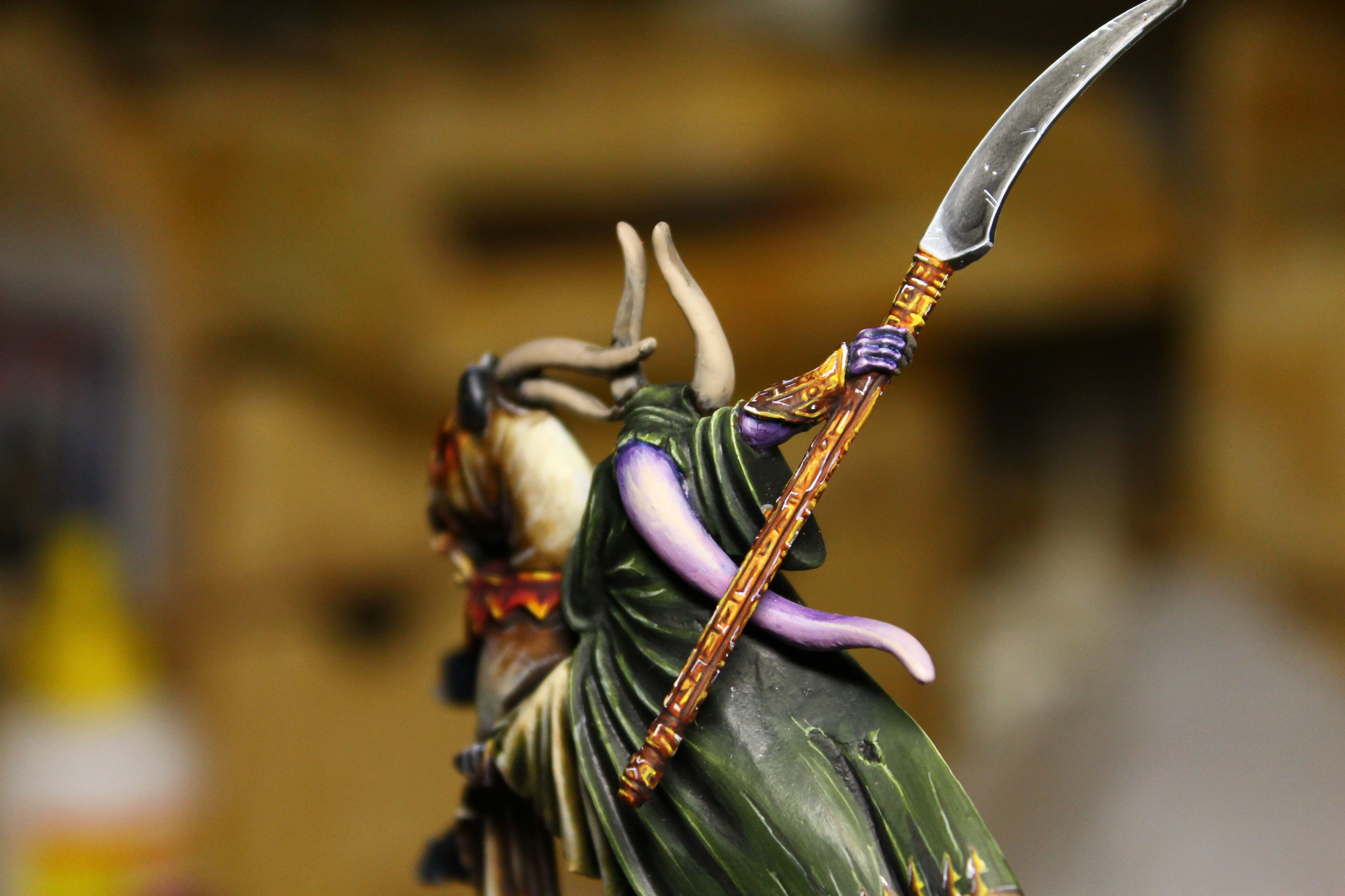
MANTELLO
Colore base : ” Military Green” 70975 Val diluito in proporzioni 50% “MG” e 50% Acqua. Per le zone in ombra ho aggiunto al colore base una piccola quantità di colore Nero. Per le zone chiare ho aggiunto al colore base piccole quantità di colore 70970 “Deep Green” Val ed ho ripassato le zone interessate fino ad ottenere il risultato voluto. Poi ho usato il 70827 “Lime Green” per i colpi di luce. Ricordarsi di diluire il colore almeno del 25% con acqua: è meglio fare diverse passate di pennello che lasciare un tratto grossolano.

INTERNO MANTELLO
Dopo aver fatto i primi chiaroscuri, ho usato una miscela di “MG” con aggiunta di colore Nero (in proporzioni di “MG” 1/ Nero 2 / Acqua 2) per creare dei segni simili a delle “Rune”, Forme Geometriche e Punti. All’interno di questi ho usato il colore 70970 “Deep Green” diluito al 50% con Acqua e poi ho ripassato i bordi “ricreati” con il 70827 “Lime Green” ben diluito. Nelle zone più chiare ho usato il “LG” con aggiunta di una piccola quantità di colore Giallo. Ho usato lo stesso procedimento nelle altre zone usando invece il colore “Deep Purple” GW diluito 50% con Acqua per le zone in ombra , poi ho aggiunto del “Tentacle Pink” GW in proporzioni 75% “DP” /25% “TP” ed ho creato delle zone più chiare. Ho miscelato ulteriormente il colore base “DP” con “TP” in proporzioni di 50% “DP”/50% “TP” ed Acqua ed ho risaltato le zone chiare.Ho usato del colore Bianco per i colpi di luce.


COAT
Base color: “Military Green” 70975 Val diluted in proportions 50% “MG” and 50% water. For the areas in shade I added to the basic color a small amount of color Black. For the light areas I added to the basic color small amount of color 70970 “Deep Green” Val and I crossed again until I got the desired result. Then I used the 70827 “Lime Green” for the hits of light. Remember to dilute the color at least of 25% with water: it is better to make several passes of brush instead of leaving a rough stroke.
INNER COAT
After having made the first chiaroscuris, I used a mixture of “MG” with addition of Black color (in proportions of “MG” 1/2 Black / Water 2) to create some symbols similar to the “Rune”, Geometric Forms and Points. Within these I used the color 70970 “Deep Green” diluted 50% with water and then I rehearsed the edges “recreated” with the 70827 “Lime Green” well diluted. In the lighter areas I used the “LG” with addition of a small amount of color Yellow. I used the same process in other areas instead using the color “Deep Purple” GW diluted 50% with water for areas in shadow, then I added the “Pink Tentacle” GW in proportions 75% “DP” / 25% “TP” and I created the lighter areas. I further mixed color base “DP” with “TP” in proportions of 50% “DP” / 50% “TP” and water and I stood out areas chiare.Ho used color for White light shots.

VESTITO
Colore base: ” Ultramarine Blue” GW diluito con Acqua in proporzione 1 “UB”/1 Acqua. Per le zone chiare ho aggiunto gradualmente al colore base delle piccole quantità di ” Space Wolf Grey” GW . Poi ho usato lo “SWG” puro per risaltare le zone di luce.
Per l’ “Armatura” ho usato l’ “UB” GW miscelato con 925 “Intense Blue” Val in proporzioni di 1 “UB”/1 “IB”/ 2 Acqua. Ho dipinto le zone chiare direttamente con l’ “IB” diluito in proporzioni di 1 “IB”/ 3 Acqua, mentre per le zone chiare ho usato l’ ” UB” puro diluito con lo stesso procedimento descritto per il vestito.

FREGI
Colore base : “Bubonic Brown” GW diluito. Dal centro del fregio verso le zone scure ho usato il 70860 ” Mediun Flashtone” Val diluito in proporzione di 1 “MF”/ 3 Acqua. Ho dipinto le zone completamente in ombra con il 71040 “Burnt Umber” Val (essendo un colore per aerografi non c’è stato bisogno di diluirlo). Per le zone chiare ho usato il 70953 ” Flat Yellow” Val diluito al 50% con Acqua. Come ultimo, per accentuare i bordi e simulare i colpi di luce ho utilizzato del colore Bianco.
SUIT
Base color: “Ultramarine Blue” GW diluted with water in proportion 1 “UB” / 1 Water. For the clear zones I gradually added to the basic color some small amount of ” Space Wolf Grey” GW. Then I used “SWG” pure to bring out the zones of light.
For the “Armor” I used the ‘”UB” GW mixed with 925 “Intense Blue” Val in proportions of 1 “UB” / 1 “IB” / 2 Water. I directly painted the clear zones with the “IB” diluted in proportions of 1 “IB” / 3 Water, while for the clear zones I used the ” UB” pure diluted with the same procedure described for the suit.
DECORATIONS
Base color: “Bubonic Brown” GW diluted. From the center of the frieze toward the dark zones I have used the 70860 “Mediun Flashtone” Val diluted in proportion of 1 “MF” / 3 Water. I have painted the zones completely in shade with 71040 “Burnt Umber” Val (being a color for airbrushes there was no need to dilute it). For clear zones I used the 70953 “Flat Yellow” Val diluted 50% with Water. As last passage to accent the edges and to simulate the hits of light I used the White.


PELLE
Colore base: 70860 “Mediun Flashtone” Val. Ho Aggiunto al colore base una piccola quantità di colore Marrone e, diluendo con acqua in modo tale che diventi tipo “lavaggio”, ho scurito le zone in ombra. Mentre per le zone chiare ho aggiunto al colore base una quantità di 70815 “Basic Skintone” Val in proporzioni 50/50, sempre ben diluito con acqua. Ho usato il “Basic Skintone” puro per i colpi di luce.
CORNA, BORSA, CINGHIE E RIFINITURE IN PELLE
Colore base : 71040 ” Burnt Umber” Val. Ho marcato le zone in rilievo con una miscelazione di colore base ed una piccola quantità di “GraveYard Earth” GW. Poi aggiungendo sempre più quantità di “GE” ho messo in evidenza le zone chiare. Per i colpi di luce ho usato del “Bleached Bone” GW. Per le corna lo stesso procedimento.
SKIN
Base color: 70860 “Mediun Flashtone” Val. I added to the basic color a small amount of Brown color and, diluting it with water until it became like a “washing”, I darkened the zones in shade. While for the clear zones I added to the basic color a quantity of 70815 “Basic Skintone” Val in proportions 50/50, always well diluted with water. I used the “Basic Skintone” pure for the hits of light.
HORNS, BAG, BELTS AND LEATHER TRIM
Base color: 71040 “Burnt Umber”. I marked the zones in relief with a mix of basic color and a small amount of “GraveYard Earth” GW. Then I added the “GE” in small amount to point out the clear zones. For the hits of light I have used of the “Bleached Bone” GW. For the horns the same procedure.

 ELMO, ARTIGLI ED ARMATURA
Per questi elementi ho seguito la stessa procedura descritta nell’ articolo “Condottiero Di Nurgle”.


BASTONE MAGICO:
-ASTA
Colore base: “Scorched Brown” GW molto diluito. Per le zone scure ho aggiunto al colore base del 71040 “Burnt Umber” Val in proporzioni di 1 “BU”/ 5 “SB”/ 3 Acqua. Ho dipinto l’asta partendo da circa la metà, poi, aumentando con piccole percentuali di “BU”, mi sono spostato verso la zona più in ombra (vicino alle vesti del mago) arrivando ad usare il colore “UB” puro per accentuare le zone più scure. Per le zone chiare ho miscelato dello “Snakebite Leather” GW al colore base e, spostandomi verso le zone più luminose ho aggiunto sempre di più una piccola quantità di “SL” fino ad usarlo “puro”. Per i colpi di luce sui bordi ho usato del ” Desert Yellow” GW. Ricordarsi di diluire sempre i colori affinchè lascino un leggero strato.
-FREGIO SUPERIORE (testa del bastone)
Colore base: 70908 ” Carmine Red” Val. Per le zone scure ho usato dello “Scab Red” Gw molto diluito e ho steso il colore diverse volte fino ad ottenere l’effetto desiderato. Per le zone chiare ho aggiunto gradualmente al colore base delle piccole quantità di 70851 ” Bright Orange” Val fino ad usare quest’ultimo puro per evidenziare meglio le parti illuminate. Per amalgamare i diversi passaggi di colore ho “lavato” il pezzo con il “Bahal Red” GW. Ho usato 70953 “Flat Yellow” Val per i colpi di luce.
HELMET, Claws and Armor
For these elements I followed the same procedure described in the “Commander Of Nurgle” ‘s article
MAGIC POLE:
-POLE
Basic color: “Scorched Brown” GW very diluted. For the dark zones I added to the basic color some 71040 “Burnt Umber” Val in proportions of 1 “BU” / 5 “SB” / 3 Water. I began to paint the pole from around the half of itself, then, increasing with small percentages of “BU”, I moved toward the zone in shade (close to the magician’s suit) arriving to use the color “UB” pure to accent the darkest zones. For the clear zones I mixed some “Snakebite Leather” GW to the basic color () and, moving towards the brightest zones, I added some small of quantities of “SL” until I used it “pure”. For the hits of light on the edges I used some Desert Yellow” GW. Always remember to dilute the colors so that they leave a light layer.
-Upper Frieze (head of the baton)
Basic color: 70908 “Carmine Red” Val. For the dark zones I used some “Scab Red” very diluted and I colored them different times until I got the desired effect. For the clear zones I gradually added to the basic color some small quantities of 70851 ” Bright Orange” Val until to use this last “pure” to underline better the illuminated parts. To amalgamate the different passages of color I “washed” the piece with the “Bahal Red” GW. I used 70953 “Flat Yellow” Val for the hits of light.

IL NIGHTMAW
Colore base:70830 “German Fieldgrey” Val e 70925 “Russian Uniform” Val in proporzioni 50/50. I passaggi che ora spiego devono essere svolti in successione. Dopo lo staro di colore base ho eseguito un “lavaggio” con “Raw Umber” W&N in proporzioni 1″RU”/5 diluente. Poi ho usato il “GF” per un “Drybrushing” soffermandomi sulle zone chiare. A questo ho fatto seguire ul altro passaggio di lavatura con il colore ad olio “RU”. Ho creato una miscelazione in parti uguali di “Catachan Green” Gw e di “Graveyard Earth” Gw ed eseguito un “Drybrushing” su tutto il modello, soffermandomi sulle zone chiare. Altro “lavaggio” di colore ad olio. Poi ho usato il “GE” Gw puro per un “Dry” seguito da una “lavatura” ad olio. Solo per le zone chiare ho usato del “Commando Khaki” Gw per un “Dry”, seguito da una “lavatura” ad olio “RU”. Mentre per le zone in ombra ho eseguito un “lavaggio” di colore Nero W&N, diluito in proporzioni 1 colore/ 5 diluente soffermandomi sulle pieghe della pelle e degli arti. Per mettere in luce le parti in rilievo dell’intero modello ho compiuto un “Drybrushing” molto leggero di colore Giallo. Un leggero “lavaggio” di “RU” in proporzione 1 colore/ 8 diluente ha armonizzato gli strati di colore.
OSSA ESPOSTE: leggeri colpi di pennello con il colore “Bleaced Bone” GW

CARNE ESPOSTA
Colore base: “Scab red” GW con una piccola quantità di colore Viola. Partendo dalle zone in ombra, ho eseguito diversi passaggi di colore fino ad arrivare alle zone più chiare. In ordine sono: “Scab Red” Gw, “Red Gore” Gw,70908 “Carmine Red” Val , “Blood Red” Gw, tutti diluiti in proporzione 1 colore /3 Acqua.

EFFETTO “SANGUE”
Per questo effetto ho miscelato il colore X-27 “Clear Red” Tamiya con il colore Nero e la colla a tubetto “UHU” in proporzioni 3 “CR”/1 Nero/ 3 Colla (le


proporzioni possono variare a seconda se si vuole ottenere del “sangue” più scuro o più chiaro, più liquido o meno liquido, o di un’altro colore sostituendo, per esempio, il Nero con il Marrone) . Ricordarsi di usare un pennello vecchio per stendere il tutto.
THE NIGHTMAW
Basic color: 70830 “German Fieldgrey” VAl and 70924 “Russian Uniform” Val in proportion 50/50. The passages that I’m going to explain have to be developed in succession. After the layer of basic color I performed a “washing” with “Raw Umber” W&N in proportions 1 “RU” / 5 thinner. Then I used the “GF” for a “Drybrushing” stopping myself on the clear zones. To this I made an other passage of washing with the color to oil (RU). I created a mix of equal parts (50/50) of “Catachan Green” GW and “Graveyard Earth” GW and performed a “Drybrushing” on the whole model, detaining me on the clear zones. Other “washing” of oil color. Then I used the “GE” pure still for a “Dry” followed by a oil “washing”. Only for the clear zones I used some “Command Khaki” pure for a “dry”, followed by the oil “washing”. However, for the zones in shade I performed a “washing” of color Black W&N, diluted in proportions 1 color / 5 thinner, detaining myself on the folds of the skin and the limbs. To show the parts in relief of the whole model I performed a very light “Drybrushing” of color Yellow. A light “washing” of “RU” in proportion 1 color / 8 thinner harmonized the color’s layers.


EXPOSED BONES: light hits of brush with the color “Bleaced Bone” GW
EXPOSED FLASH
Basic color: “Scab red” GW with a small amount of color Purple. Departing from the zones in shade, I have performed different passages of thin color to arrive to the clearest zones. In order they are: “Scab Red “GW; “Red Gore” GW; 70908 “Carmine Red” Val; “Blood Red” GW, all diluted in proportions 1 Color / 3 Water.
“BLOOD” EFFECT
For this effect I mixed the color X-27 “Clear Red” Tamiya with the Black color and the tube glue “UHU” in proportions 3 “CR “/1 Black / 3 Glue (the proportions can vary if the “blood” is wanted darker or clearer, more liquid or less liquid, or of another color replacing, for example, the Black color with the Brown one). Remember to use an old brush to stretch the everything.
 PAVIMENTO IN MARMO
Ho intagliato un cilindro di legno (acquistato in un negozio di Hobbystica) creando dei gradini. Ho coperto la superficie con abbondante stucco per modellismo e l’ho livellato con una spatoletta. Appena asciutto ho inciso con varie punte metalliche lo stucco per creare la pavimentazione ed il simbolo del Caos. Prima che la base fosse pronta per la pitturazione ho incollato del pietrisco.
Colore base: 70860 “Medium Flashtone” Val. Seguendo la conformazione della pavimentazione , le crepe e le spaccature ho dipinto la pietra con “Bleached Bone” Gw e 70951 “White” Val, MOLTO DILUITI, creando delle “macchie” tipiche del marmo.
Ho diluito il colore ad olio “Raw Umber” W&N con del diluente in proporzioni 1 colore/5 diluente e, con la punta di un pennello, ho colorato le linee di fuga, le crepe e le spaccature, Ho ripetuto diverse volte questa operazione fino ad ottenere l’effetto di mio gusto. Con del colore Rosso e del colore Blu, molto diluiti, ho creato delle venature nel marmo. Ho Usato del “Raw Umber” diluito in proporzioni 1 colore/8 diluente per dare tridimensionalità alle crepe ed ai dislivelli della pavimentazione. Ho esaltato i particolari usando il colore ad olio “Ivory Black”W&N (1 colore/5 diluente).
Per il  simbolo del Caos ho usato lo stesso procedimento spiegato precedentemente, usando però come colore base il 70985 “Hull Red” Val, del colore Rosso per le macchie e del Verde e Arancione per le venature.
MARBLE FLOOR
I carved a wood cylinder (purchased in a shop of Hobbystica) to create some steps. I covered the surface with abundant of plaster for modelling and I leveled it with a small spatula. Just dry I engraved with various metallic points the stucco for creating the flooring and the Chaos’ symbol. Before the base was ready to be painted, I had glued some rubble on it.
Basic color: 70860 “medium Flashtone” Val. Following the conformation of the floor, the cracks and the breakings I painted the stone with “Bleeched Bone” GW and 70951 ” White” Val, VERY DILUTED, creating some “stains” typical of the marble.
I diluted the oil color “Raw Umber” W&N with some thinner in proportions 1 color / 5 thinner and, with the point of a brush, I colored the lines of escape, the cracks and the breakings. I repeated different times this operation until to get the effect of my taste. With some Red and Blue color, very diluted, I created some veins in the marble. I used of the “RU” diluted in proportions 1 color / 8 thinner to give three-dimentional form to the cracks and the gradients of the floor. I exalted the details using the oil color “Ivory Black” W&N (1 color / 5 thinner).
For the symbol of the Chaos I used the same procedure previously explained, but I used as basic color 70985 “Hull Red” Val, some Red color for the stains and some Green and Orange for the veins.


Lavoro finito, spero vi sia piaciuto….
Ended job, I hope you enjoied it….


 del “Codex Grey” seguito da un “lavaggio” di “Terra D’Ombra” olio della W&N, stessa diluizione precedentemente spiegata . Ho ripetuto il ” Drybrushing” con il “CG”. Ho eseguito un “lavaggio” con del “Nero Avorio” W&N seguito da “Drybrushing” di “Flat Earth” 70983 Val, “Codex Gey” GW, “Flat Yellow” 70953 val e del ” Bleached Brown” GW. Ho , poi , incollato in posti strategici degli steli di “Poseidonia” e chiazze di foglie sminuzzate.


